
An Accessible Platform to
Streamline Rental Property Acquisition
PROJECT TYPE
Startup, 0-1, Responsive Design
DURATION
6 Months
OUTCOME
Soft Launch to Target Users
TOOL
Figma
MY ROLE
Product Designer
TEAM
Principle, Developers
Background
Fruta Invest, a property management and investment company, possesses a strong $25M portfolio with 50+ units spanning multiple states. As growth continues, the need for a new platform arises—to source, purchase, and manage properties at an institutional scale, optimizing user experience.

Transformation to a new “all-in-one“ platform
As the only designer in the team, I worked closely with the principle and dev teams to develop project roadmaps, coordinate and lead all facets of design including: design research, ideation, information architecture, use flows, UI/UX prototyping and testing.

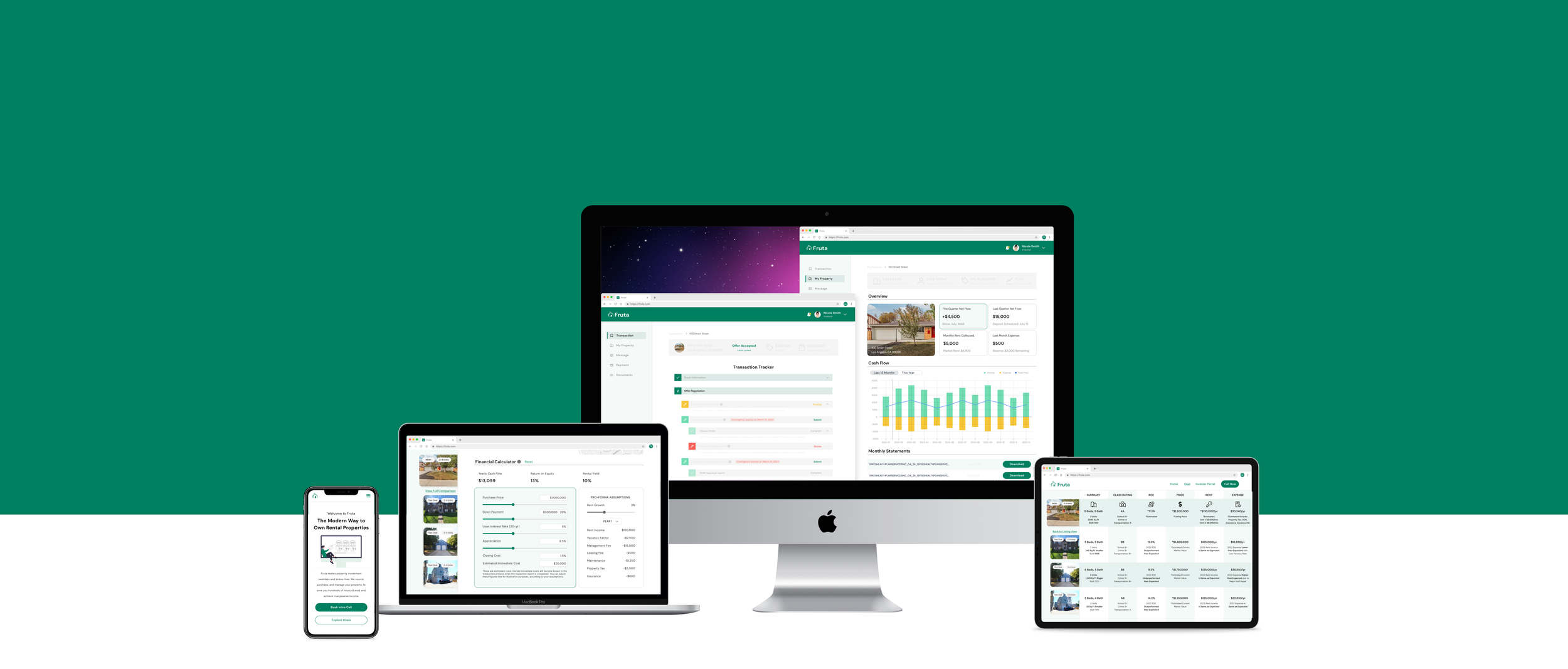
Product Preview
Demo: Listing View and Interactive Financial Calculator
Demo: Property Transaction Tracker
Redefine Rental Property Investment
In contrast to the intricate, time-intensive traditional rental property investment journey, Fruta introduces a seamless alternative. By offering all-inclusive services from acquisition to management, tailored for busy professionals, Fruta promises ease and exceptional returns that align with their financial goals.
Traditional user journey Vs. Fruta’s one-stop-services (Click the image to enlarge)
Seize A New Business Opportunity
In the context of inflation and asset diversification, Fruta recognizes the growing demand for secure passive income through rental property investment. With the vision to address this market gap, I was tasked to build a user-centric platform with the goal to enhance rental property investment, making it transparent and accessible.

Comparison of different rental property investment methods
Project Approach
To kickstarted the project, I first set up a timeline to keep the team informed and aligned. I also defined KPI (visitor-to-registration rate, CSAT score, user base growth, etc.) to track user actions and measure success of the design.
Project Timeline (Click the image to enlarge)
Challenges
As the sole designer report directly to the principal, I faced multifaceted challenges at the beginning of the project:
Ambiguous Product Roadmaps: With the company's on-going expansion, the project had an unclear feature set.
Rapid Deployment Demands: The need for a swift product launch to engage investors while delivering an optimal user experience.
Balance User Experience and Security: Property transactions necessitated harmonizing seamless user interactions with robust security measures.
User Research & Insights
To address these challenges and advocate for the users, I began by collecting feedback from past work logs and emails. With a deeper comprehension of the issue, I then conducted six interviews involving both existing and potential investors. This process aimed to gain an in-depth understanding of the needs and challenges encountered by our target user groups.

Michael, new to investing in real estate and lacks experience:
“I find the real estate investment process overwhelming and time-consuming. It's difficult to identify properties with good return and appreciation potential.”

Sarah, a busy professional juggling work and family duties:
“I have no time to actively manage investments. My financial goal is to maintain a diversified portfolio with stable passive income, and, of course, avoid any liability issues.”
Understand Property Acquisition
Based on the research and user interview, I mapped the user journey to align pain points and identify opportunities where Fruta's services could facilitate and enhance user experience.
User Journey Map (Click the image to enlarge)
Prioritization Matrix and MVP
Centering on user needs, I proposed 10 essential features for the new platform. However, due to limited resources, and after consultation with the dev team and principle, I drove the decision to prioritize the "source-evaluate-purchase" pathway for the Minimum Viable Product (MVP), as this pathway served as the starting point to expand the user base while remaining technically feasible.
Prioritization matrix of 10 proposed features (Click the image to enlarge)
Redefine Design Goals
Within the MVP framework, I redefined the design objectives to focus on empowering users with an efficient and streamlined experience:
HMW empower users with confidence in vetted deals?
HMW provide assistance and support for users to better comprehend various factors that influence returns, to make informed decisions?
HMW streamline complex property transactions involving multiple parties while ensuring data privacy, security, and legal compliance?
Design Iterations
01 Source - Listing Page
Embark design amidst uncertainty
As I commenced the design process, the dynamic market posed a challenge: the lack of prepared deals led to uncertainty regarding website content and marketing materials. To move the needle, I proposed content placeholders, drawing from my understanding of user preferences and competitor content strategies, to keep the ball rolling while waiting for the availability of finalized content.
Develop a user-centric approach with focus on “Default” deal
In response to the feedback regarding information overload and data credibility, I drove the design forward by accentuating Fruta's vetted deals. This strategic emphasis aimed to distinguish Fruta from its competitors, alleviate users from the burdens of exhaustive research, pre-work and overwhelming choices, and transform decision-making into a more focused and engaging process.
02 Evaluate - Financial Calculator Tool
Reality check with stakeholders
The financial calculator serves as a pivotal tool for users to evaluate investments and guide decision-making. The following are my initial wireframes, informed by thorough user research and industry insights. Prior to user testing, I invited stakeholders to evaluate the design and ensure its technical viability.
Advocate good UX with interactive tools
While the principal raised concerns about the development cost of interactive tools versus a static page, I firmly believed that interactivity was pivotal for ensuring a good UX experience. After addressing technical issues, I proceeded with user testing and received very positive responses to interactive tools. Users valued the capacity to personalize calculations based on their inputs, enhancing data apprehension and facilitating a more accurate assessment on returns.
Ultimately, the principle approved the interactive tools design, provided it upheld optimal page load times and performance. In terms of feedback on state-based cost variations, while offering comprehensive solutions for all scenarios is crucial, but unfortunately, this feature was beyond the current scope.
03 Purchase - Transaction Tracker
Initial concepts testing: “horizontal vs. vertical” progress bars
To address the primary pain point of a convoluted transaction flow that overwhelms users and leads to stress and errors, I explored two distinct progress indicator design - horizontal and vertical - to streamline the process. Through a quick Heuristic Evaluation, I determined that the vertical progress bar better suited the complexities of property transactions.
Evaluate design feasibility
Having established the vertical progress bar layout, I proceeded to outline all the steps, categorizing them into four groups aligned with transaction milestones. Recognizing the complexity of the process, which involves diverse security measures spanning development, finance, operations, and legal considerations, I convened a team meeting to evaluate the feasibility of executing these steps while ensuring a smooth user experience.
Elevate user success for all scenarios and edge cases
Property transactions are intricate and demand a comprehensive solution that accommodates various scenarios, allowing users to navigate tasks successfully. After conducting multiple rounds of testing with both co-workers and users, I employed diverse strategies to enhance clarity and visual hierarchy to establish a clear and intuitive pathway to completion.
04 Mobile Experience
Recognizing the significance of mobile usage, I crafted a mobile experience featuring a consistent user interface, optimized layouts, and navigation tailored for smaller screens. However, due to security considerations, the mobile design was limited in its offerings. Still, users could access property listings, track progress, and stay informed about their investments at any time and from any location.

05 Design System
In addition to the web and mobile design, I also created a new design system and brand identity to lay the groundwork for Fruta Invest’s digital brand success, enhancing the handoffs process to dev team and onboarding experience to new members.

Outcome and Impact
The MVP has been privately deployed to a select group of both novice and experienced investors for exploration and evaluation of investment opportunities. The newly introduced platform has garnered positive recognition from both the management team and clients.
“The new platform attracted a growing user base, our clients are much happier to see deals on a real website!“ - S.Z, Principle of Fruta
Next Steps
The MVP marks the initial phase. I am committed to ongoing contributions to the platform's development, enhancing the UX for an empowering rental investment experience in line with the strategic roadmap.
As the owner and designer of the platform, I will actively monitor site performance against defined KPIs and track user interactions. This data will guide iterative design enhancements aimed at expanding the company's user base.
Reflection
As the only designer to build the 0-1 process for a new platform, I faced a rewarding challenge. This experience not only allowed me to practice and enhance my UX skills, but also refined my product thinking.
Discuss the project's roadmap with stakeholders early on
Instead of pursuing an all-encompassing platform catering to every current and future service, prioritization and strategic planning were essential. This approach ensured a more focused and efficient strategy, delivering maximum value to users and the company.
Always advocate for good UX
Despite launch pressures and cost constraints, I unwaveringly persisted in pushing for rigorous testing and refinement. This effort led to validating the significance of interactive tools and ultimately convinced stakeholders to prioritize the finest UX design for users.
Thank you.
This is the end of this case study.
Other Projects >>>

