
The Power of AI: An Analytic Dashboard to
Improve Productivity and Help Troubleshooting
MY ROLE
Product Designer
PROJECT TYPE
SaaS Dashboard (*This project is under NDA, please don’t share.)
DURATION
2 Months
TOOLS
Figma
OUTCOME
Shipped in May, 2023 🎉
TEAM
Senior Product Designer, UI Designer, Project Manager, Developers
Background
According to a McKinsey Future of Work report, 60% of jobs involve repetitive and automatable tasks. The client is developing an AI-powered contract processing automation product to enhance productivity for enterprise users. This product adopts an "observe, learn, and automate" approach, identifying repetitive steps, learning from user feedback, and therefore “auto-complete“ everyday’s mundane and repetitive tasks.
As part of the project, I worked with two other product designers, and a senior designer to revamp the the main screen of the dashboard. Our primary focus was on employing efficient data visualization to help enterprise users track automation accuracy and team performance.
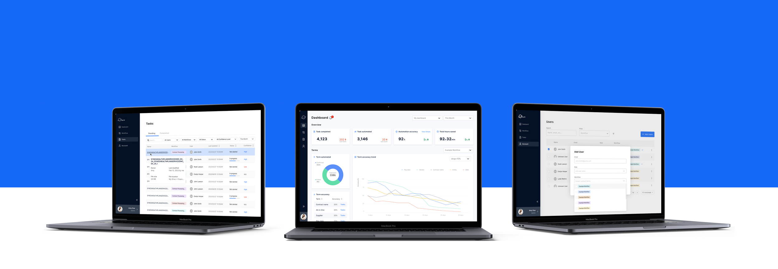
Product Preview
Admin Dashboard (Click the image to enlarge)
Build User Trust and Enhance Efficiency
The product aims to process over 100k contracts annually, servicing both financial administrators and end users/finance analysts. Accuracy and efficiency are crucial for these user groups. However, since automation is hidden from view, a central challenge was cultivating robust user-product trust and fostering user confidence in the product's utilization.
Workflow between users and the software (Click the image to enlarge)
Goals
The success of the software centered on two main aspects: transparency in accuracy and efficient troubleshooting mechanisms. Therefore, the main purpose of the dashboard is an analytic tool to refine automation via user input, swift error detection, and closely monitor team performance to enhance automation efficiency and foster user trust.
Identify Key Metrics That User Needs
To understand how this product assists enterprise users in automating contract processing, we conducted user interviews with both financial administrators and business analysts to gain a thorough understanding of their work routines and challenges they face while processing contracts. Also, I engaged with the dev teams to comprehend the logic of the automation process, and what data users could obtain.
Having sifted through all available resources, I was able to identify the key metrics that user needs to measure the achievement of their goals.
Key metrics related to user goals (Click the image to enlarge)
What Data to Show
As I delved into the interface and interaction design for the analytical dashboard, I encountered another challenge: How could we effectively transform unsorted data into easily digestible infographics and provide actionable insights? So users could report technical issues and enhance the automation model.
“Why-What-How”
By analyzing user workflows and considering potential user interactions with the software, I assumed the role of a problem solver, aiming to address user issues. I initiated the process by crafting user stories using the "Why-What-How" framework to establish connections between user goals, metrics, data visualizations, and translate into programmable logics.
User stories based on “Why-What-How“ framework (Click the image to enlarge)
With a focus on user needs at the forefront, I guided the decision-making process to categorize all data into three distinct groups - “Overview“, “Term Accuracy“ and “Team Performance“. These groups would be showcased on the dashboard, each dedicated to addressing a specific type of issue at a time.
Reframe Design Question
Once the key data for the dashboard had been identified, we convened meetings with stakeholders and engineers to ensure alignment between business objectives and design priorities. Through this collaborative effort, our team redefined the design question that became the overarching goals throughout the design process:
HMW design the dashboard so users can swiftly understand software performance, thereby enhancing their confidence in continued usage?
HMW streamline the process for users to detect software anomalies and effortlessly report them for rectification?
HMW enable users to monitor team member contributions and pinpoint deviations or outliers?
Design Iterations
Data visualization
Rather than approaching data presentation from a purely technical perspective, I took the lead in developing prototypes for a range of data visualizations with the following questions in mind:
What is the purpose of each visualization, for display, trend or comparison?
What will be the most efficient and simple way to understand immediately?
How to tackle complicated metrics, such as team performance, combine or single charts, or break the metrics into multiple


Alert and insight panel
One of the other key features of AI products is the model allows to help users address issues promptly, preventing delayed response to issues before it getting even worse. An alert/insight panel enables users to make decisions quickly in daily work.

Design Solution
Scenario 01


Scenario 02


Outcome and Impact
100%
Rollout rate
80% ↑
Review efficiency
Next Step
Customization: Allow users to personalize the location and category of metrics cards according to their preferences.
Responsive Design: Implement a responsive design template for various platforms, including mobile and iWatch.
Diverse Drill Down: Explore additional applications of drill-down functionality in key metrics cards to provide data-driven insights.
Reflection
Design Scope: Throughout the design process, I have been keen on defining clear delivery expectations and success metrics from the project's outset, ensuring a well-guided approach. By identifying actual user needs early on, I aimed to drive the product's success and create a user-centric solution.
Prioritization: During the project, prioritization played a critical role, and I focused on selecting design features that align with the MVP's goals for a timely product launch. My emphasis on tailoring the design to match user goals and needs allowed me to create an intuitive and efficient user experience.
Deviation Cost: To manage deviation cost effectively, I leverage open source code and design systems to save time and effort while maintaining consistency across products. Additionally, regular meetings with engineers and stakeholders allowed for valuable feedback, leading to feasible design iterations and enhancing the final outcomes.
Domain Knowledge: Throughout the journey, domain knowledge was key. Understanding the B2B product domain, including the target market, user needs, behaviors, and workflows, allowed me to create usable, unbiased designs that adapt to evolving requirements, resonating with users and delivering optimal results.
Thank you.
This is the end of this case study.
Other Projects >>>

